Improving the onboarding flow to prevent user drop-off
Overview
Success Metrics
Onboarding completion rate
Duration
1 Month
Process
Design Research, Ideation. User Flows, Validation, Cross-Team Review, Stakeholder Collaboration, Component Library
Users

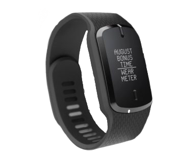
Panelists are people who elect to wear the Nielsen Meter so that their media viewing data can be collected.
Nielsen Meter

Project Context
While this product fell outside my usual responsibilities, I embraced the opportunity with enthusiasm because I was eager to work on a product that generated data for my core product, Audience Builder.
Business Impact
Nielsen uses Panelist data to generate analytics which feed analytics products used to drive strategic marketing decisions costing millions of dollars.
Problem

Testing revealed that 74% of users felt confused when setting up app preferences.
If the user does not set up app preferences properly, data collection is disrupted.

Problem Statement
Redesign the Companion App Onboarding Experience to Prevent User Drop-off
Empathizing with Users
I put myself in the user’s shoes by emphasizing with how they might feel during the onboarding experience.

Issue #1
There is redundant copy. The user might feel frustrated at unclear messaging.
Issue #2
Incorrect use of design system primary color. The user might feel the high contrast color is jarring on the eyes.
Issue #3
The UI does not inform the user of where they are in the process. The user might feel uneasy about how long the preference setup will take.
Issue #4
UI is content heavy with lots of competing information. The user might feel overwhelmed trying to comprehend all the info.
Issue #5
The primary action button is hidden hidden by the background color. The user might feel overwhelmed trying to comprehend all the info.
Ideation
Design Goals
Increase onboarding completion rate
Invoke a feeling of ease in the experience.
Create consistency with the Global Design System.
Secure stakeholder buy-in for experience-enhancing redesigns.
Design Research
I research other products and browse pattern libraries to identify best practices and find inspiration.
I look for examples that are modern, colorful, engaging, and easy to implement (given the time crunch)!
Cross-Team Collaboration
I collaborate with developers, product owners, and data scientists to revise the flow and build consensus on the experience. Stakeholders point out missing information, technical limitations, and more.
User Flows
The user flow is a useful visual for facilitating design discussions with stakehodlers and uncovering hidden requirements.
Design Decisions
Decision #1
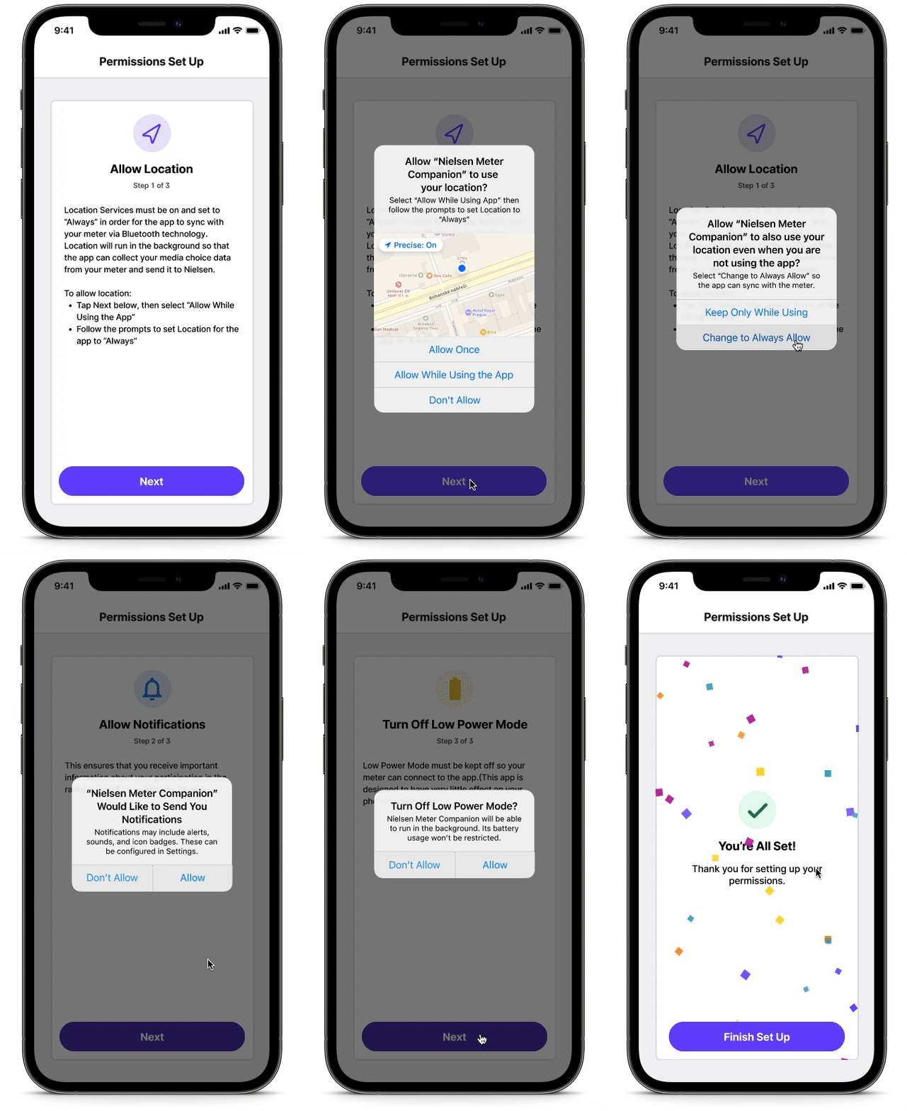
Add concise headers to each screen. It helps the user quickly understand at a glance what the screen is about
Decision #2
Add a step counter. Clarify how many steps the process will take.
Decision #3
Add recognizable icons. Build a positive impression of the product
Decision #4
Remove redundant copy. Simplify the content.
Decision #5
Add “You’re almost done!”. Convey additional steps needed.
Decision #5
Change the purple background to light gray. Promote consistency with the Design System
Decision #7
Add a confirmation screen with confetti animation. Promote a sense of satisfaction and assurance that the task was completed successfully!

Before & After
〰️
Before & After 〰️
Location Preferences

Account Created

Before/After
〰️
Before/After 〰️
Notifications


Battery

Before/After
〰️
Before/After 〰️
Alert Messages
Stakeholder Feedback

Stakeholders loved the updated flow and committed to prioritizing improvements in addition to what was originally scoped, allowing me to accomplish Design Goal #4, “Secure stakeholder buy-in for experience-enhancing redesigns.”

Validation
I created a prototype and conducted usability testing with 7 users to validate my designs before the implementation stage of the process.
All 7/7 users successfully finished onboarding.

The design was shipped and implemented.
Analytics revealed an awesome 43% increase in Panelist retention after onboarding.

Final Mocks
Challenges
Build Trust, Be Articulate
Faced with a tight deadline and a new team, I prioritized building trust with key decision-makers by being very articulate about how and why I made design decisions.
Don’t Ask Permission to Design
I was asked to redesign only the preferences flow, but I saw other areas that caused pain points. I showed them solutions first, allowing them to witness the potential improvements firsthand, leading to consensus about additional improvements to the experience.
Takeaway
Discover Resource-Effective High-Impact Design Choices
Following this project, even amid tight timelines and uncertainty, I am committed to identifying impactful improvements that enhance the user experience.


