
Streamlining the audience workflow to help clients make strategic marketing decisions
Overview
Duration
12 Months
Success Metrics
Target users are able to create, manage, and adjust audiences within the platform
Stakeholders
Developers, Product Managers, Product Owner, Product Designers, Design Systems Lead
Process
Defining requirements, Ideation, User Flows, Validation with Users, Cross-Team Review, Stakeholder Collaboration, Component Library, Design System, QA
Problem

The internal CX team dedicated excessive time guiding clients through the audience-building process.
Streamlining this workflow was essential to enhance efficiency within our internal CX team.
Users also complained about the outdated legacy product’s visual aesthetic.
Business Impact

I played a key role in crafting Nielsen ONE, a game-changing product designed to serve up consolidated, cross-media metrics all in one spot. This nifty tool empowers users to plan, optimize, and fine tune their campaigns with confidence.
Platform Overview
Nielsen ONE is a cross-media solution that lets advertisers/buyers and publishers/sellers plan and transact on a single set of reliable, independent, and standardized comparable metrics across linear and digital.

Problem Statement
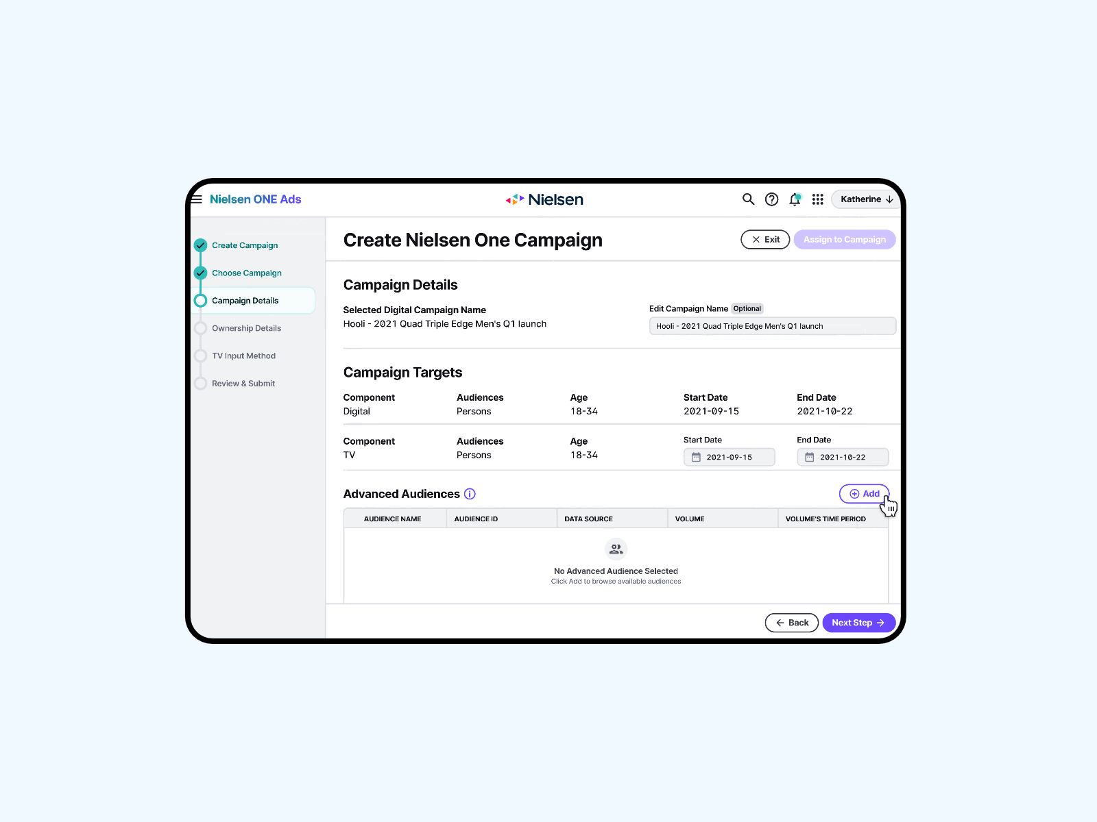
Streamline the audience creation workflow.
Redesign and integrate the experience with the Nielsen ONE platform.
Users
Media Buyers

Need to analyze performance across campaigns and optimize advertising reach and frequency.

Media Sellers
Need to understand reach ability using audience data.

Design Goals
Redesign Audience Builder with MVP requirements, while keeping future functionalities in mind.
#1
Integrate the experience with the Nielsen ONE workflow.
#2
Optimize available resources by prioritizing the use of existing components within the design system and thoroughly evaluate the necessity of constructing new components.
#3

User Interviews
To inform the customer journey, 6 user interviews were carried out involving experts possessing in-depth knowledge of the marketing campaign and client engagements with B2B partners informing customer journey pain and touch points.
Customer Journey
User Flows
I create a user flow from the initial requirements to puts myself in the shoes of the user and generate curiosity and ideas throughout the workflow
Iteration #1
Design System
I had the pleasure of working with an existing design system that allows me to create close-to-high-fidelity mocks easily.
The flip side is I need to work within some predefined constraints when designing new pages, have domain knowledge of the entire system’s various user flows, and utilize existing patterns of interaction.
Design Rationale
After the required inputs and selects, the user selects the time period. Selections show up in the volume section, where they can click Check Volume.
Assumptions
1. The user wants just a few volumes
2. The check volume process is quick.
3. The user need to hare with their tenant/organization.
Collaborate with Stakeholders
I work with PMs and Engineers to add constraints and help uncover and define requirements.
Iteration #2: Mapping Feedback to Design Decisions
Design Decision #1
I added an error state for the audience name input if invalid characters are typed in.
As well as an empty state to the table to inform users what to do in order to compute a volume.

Design Decision #2
I disabled the ID space select to convey that ID space and data source are connected.
ID Space select becomes enabled when the user has selected a data source.
Design Decision #3
I consolidated the time period select and check volume function into a table. This is a better use of the space compared to Iteration 1.
I opted to not add a select all function to the checkbox column to prevent technical difficulties in the backend.

Design Decision #4
Once volumes have been computed, unneeded elements are disabled.
Reset button allows users to change inputs but also warn users of costly actions.
Design Decision #5
Disabled checkboxes → Communicate to users that they cannot alter the process.
After user clicks check volume, I added a skeleton loader → This communicates that a process is happening.
Design Decision #6
I removed the checkbox from rows with computed volumes since there is no reason the user would , or should, unselect the row.
I added a success toast message to communicate that the process was successful.

My Method for Solutioning
Weighing the pros and cons provides a structured and systematic approach to decision-making.
Some questions I ask myself while creating pros and cons for my design options:
What are the positive aspects of this design?
What are the limitations or weaknesses of this solution, and does it scale well for the future?
Does this solution introduce more pain points?
Does this solution require more resources to implement, and if so, is it worth it?
Why this works…
Transparent Decision Making
Clear design decision articulation facilitates communication and collaboration among team members, stakeholders, and clients.
Engage Stakeholders in Design
Openly discussing potential challenges allows for collective problem-solving and ensures that everyone is aligned on the chosen solution.

Compute Volume Ideation
〰️
Compute Volume Ideation 〰️
Option 1 Use the out of box table component has a built-in error state.
Pros
I like that the red highlight makes it easy to understand “something is wrong.”
Cons
If the user has computed multiple volumes, the rows with errors would be hidden below the scroll bar and the user might need to scroll to see or know which volume failed. This would not be sufficient.
Option 2 Consider a system banner message.
Pros
This makes it clear which month did not compute.
Cons
But if there are multiple months, there would be multiple banner messages pushing the content down, or a long message within the banner, which told me this was not a good solution either.
Option 3 Add a status bar above the table, where the user needs the info.
Pros
I liked that this made it very clear the status of all volumes being processed.
Unlike option 2, it was always visible, and unlike option 1, did not hide information under the scroll bar.
Cons
Personally, I think the UX is good but there is a more aesthetic solution.
Option 4 Building upon Option 3, I color-code the status.
Pros
It looks fun.
The status of all volumes being processed is clear.
Cons
Other products in the system use these colors for other purposes and I don’t want to confuse the user when they switch between other products in their workflow.
Option 5 Building upon Option 4 and changed the colors to gray.
Pros
The user can see the status of all volumes being computed without scrolling
The UI is more pleasing than plain HTML text
The color of the chips does not interfere with other system colors.
After meeting with stakeholders and reviewing with my design team, this is the design we moved forward with.
Iteration #3: Finishing Touches
I added an additional step to the builder process to showcase upcoming capabilities.
Testing & Validation

I created a prototype and conducted a usability test with 7 users, focusing on key flows.
All 7/7 users successfully created audiences without any assistance needed!
CEO Demos Product at Cannes Film Festival
Project Reflection
Takeaways
Behind this seemingly simple form were countless meetings with stakeholders to
understand the technical limitations
grasp complex concepts
align with 3 other products in the platform.
Challenges
I learned to design with the whole system in mind to maintain platform consistency and manage effective collaboration with 4 teams simultaneously.
What’s next?
Media Buyers and Sellers can attach audiences to a campaign and generate analytics.
Case studies

Companion App
Increasing user retention by over 40% during onboarding.

Spectrum.net/support
Understanding customer pain points through quantitative data analysis